
Archifacts
Aranz
Intro
A complete redesign of an academic journal. Make it modern! Make it visually engaging. We started from absolute scratch, and questioned everything.

ARANZ
The Archives & Records Association of New Zealand Te Huinga Mahara (ARANZ) is not interested in being left on a dusty shelf.
This organisation wants to be in the light, and it wants its annual journal, Archifacts, to shine, to be a matter of record, to be proud of.

We asked for a broad scope to make radical suggestions, and ARANZ was happy to oblige. Archifacts editor Sarah Welland supplied us the words and images, and we handled everything from that point until the journal hit the printing press.


Graphic Design
Creative design for digital and real-world applications.
Social media graphics, banners, billboards, packaging, signage, and everything else.

editing
Professional editing, proofreading, fact checking and guidance.
We can help you write top quality web copy, professional documents, nonfiction and fiction books. 100% guaranteed to be better than ChatGPT.


Publishing
We specialise in publishing real-world content. We can handle every aspect of writing, editing, designing and preparing for print.
Brochures, catalogues, magazines, books, cards and professional reports.

advertising
Whether you’re going digital, real-world, or hybrid, we can help you create an advertising strategy, then handle every aspect of writing, designing, buying advertising and managing campaigns.
Experts in Google and Meta (Facebook & Instagram) advertising.
Traditional meets new
Most academic journals now are published purely online. It was a pleasure and a luxury to be trusted with publishing a hard copy journal, and creating a template for what a journal could look like in 2024. In the research phase, we wanted to establish what the “traditions” are for journals: what are the visual cues that identify this as a collection of academic works?
What we found was… nothing. Nothing good, anyway. There was little cohesion between existing journals, other than a common use of block colour on the cover (if any colour was used at all). Design was all over the place, and there weren’t even any consistent norms for the order and structure of internal elements. So, we threw it all out.
Day 1 thinking, how would we design a journal?
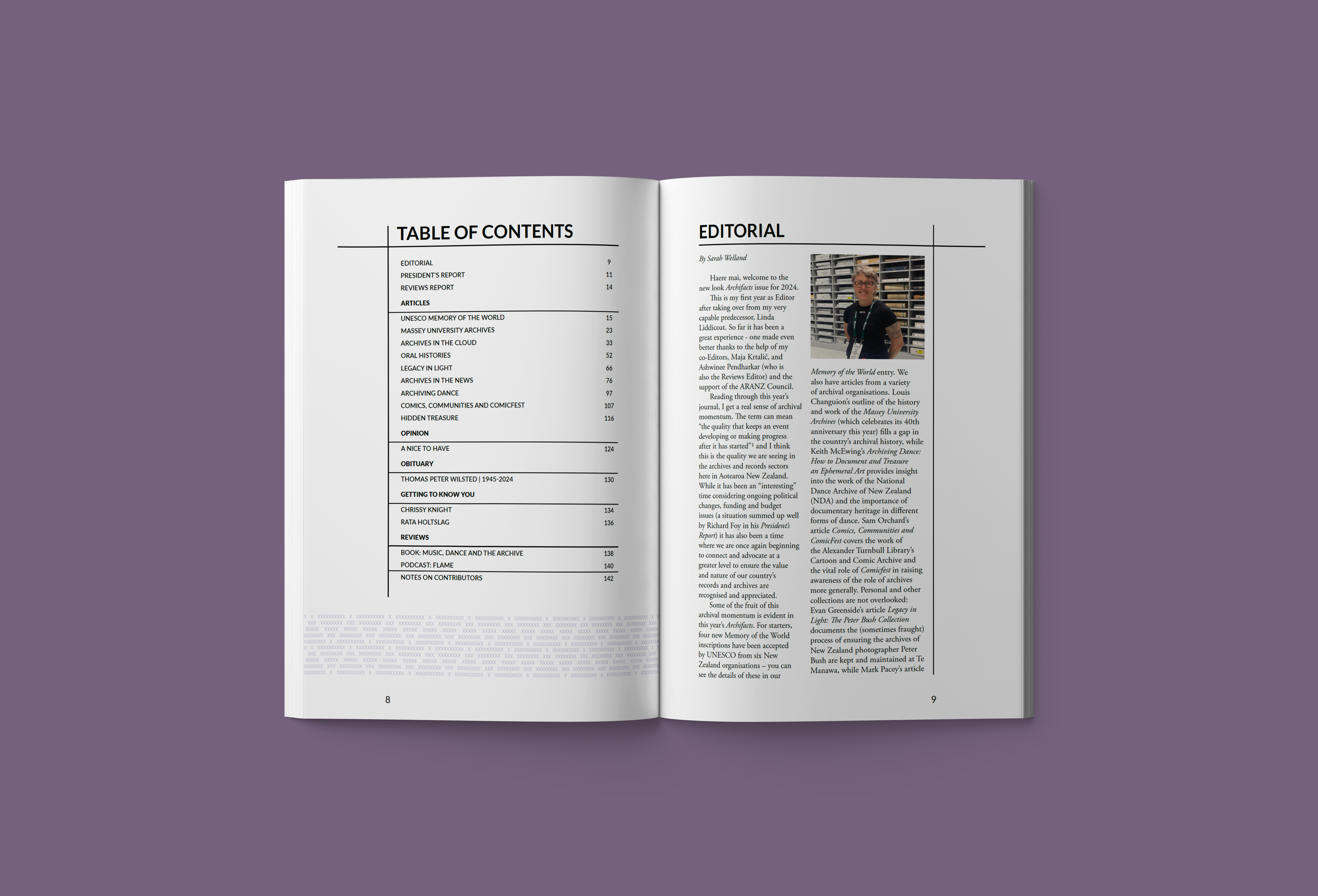
Well, we’d want it to be easy to read, sylish, and replicable so that the client doesn’t need to spend an inordinate amount of money redesigning layouts each year.
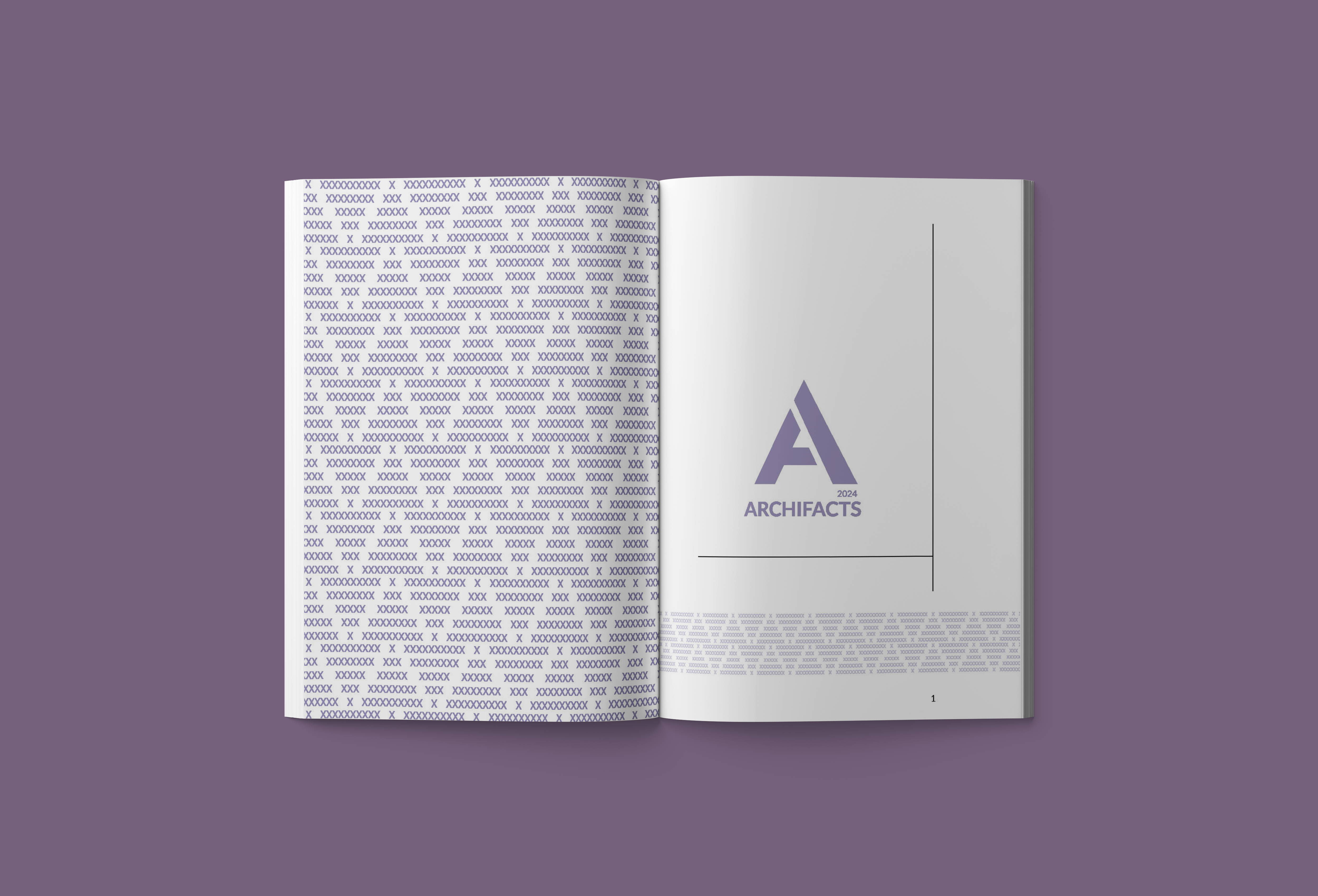
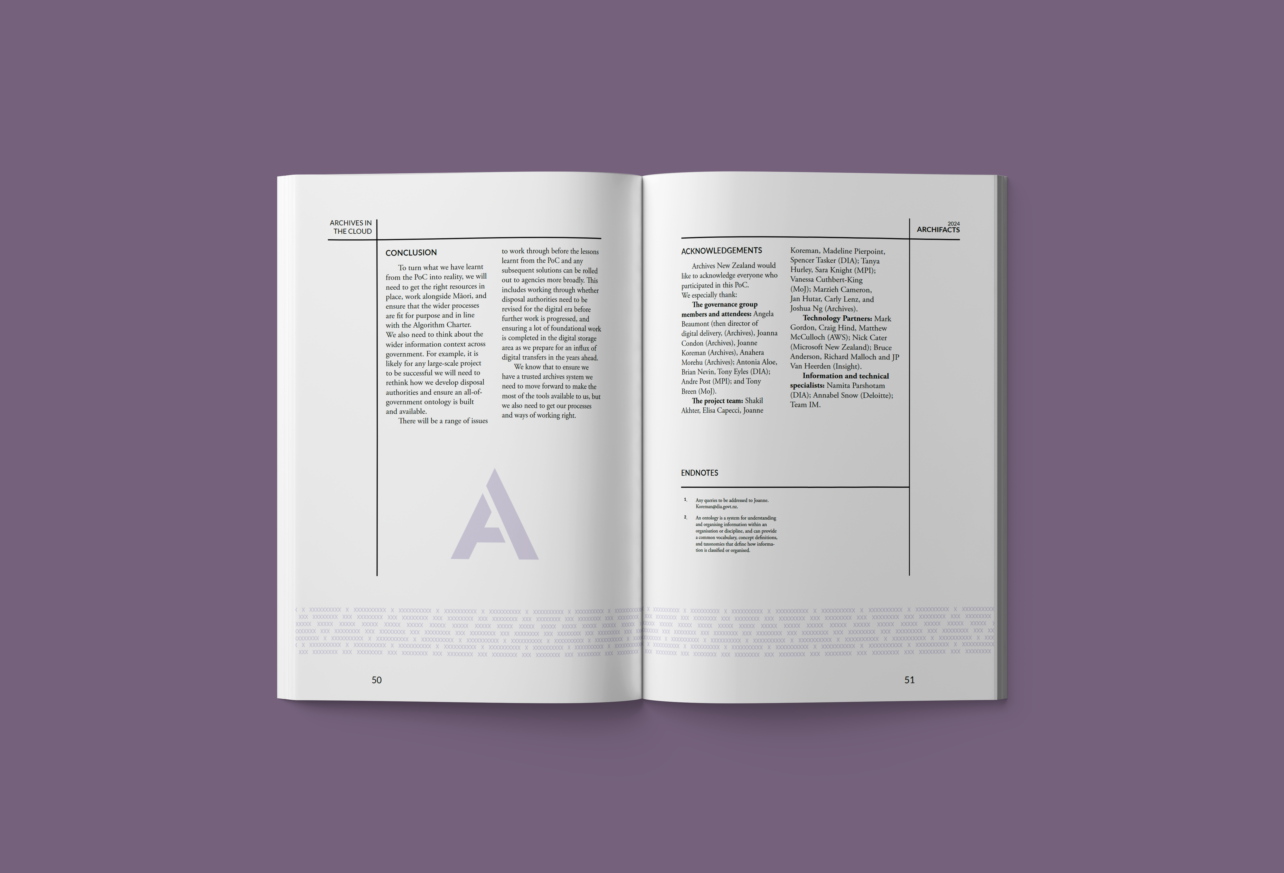
We’d want to introduce white space, use a respectable serif font, and bring in a visual language that ties it all together.
White space is all well and good, but we didn’t want to blow out the page count and cause unnecessary printing fees. So we designed, we mocked up, we tested, we redesigned, optimised and tested again until we built a layout that was inherently readable, with an acceptable page count.
Let’s do it again
We will be working with ARANZ to publish Archifacts again, and again. So what will the next issue looks like.
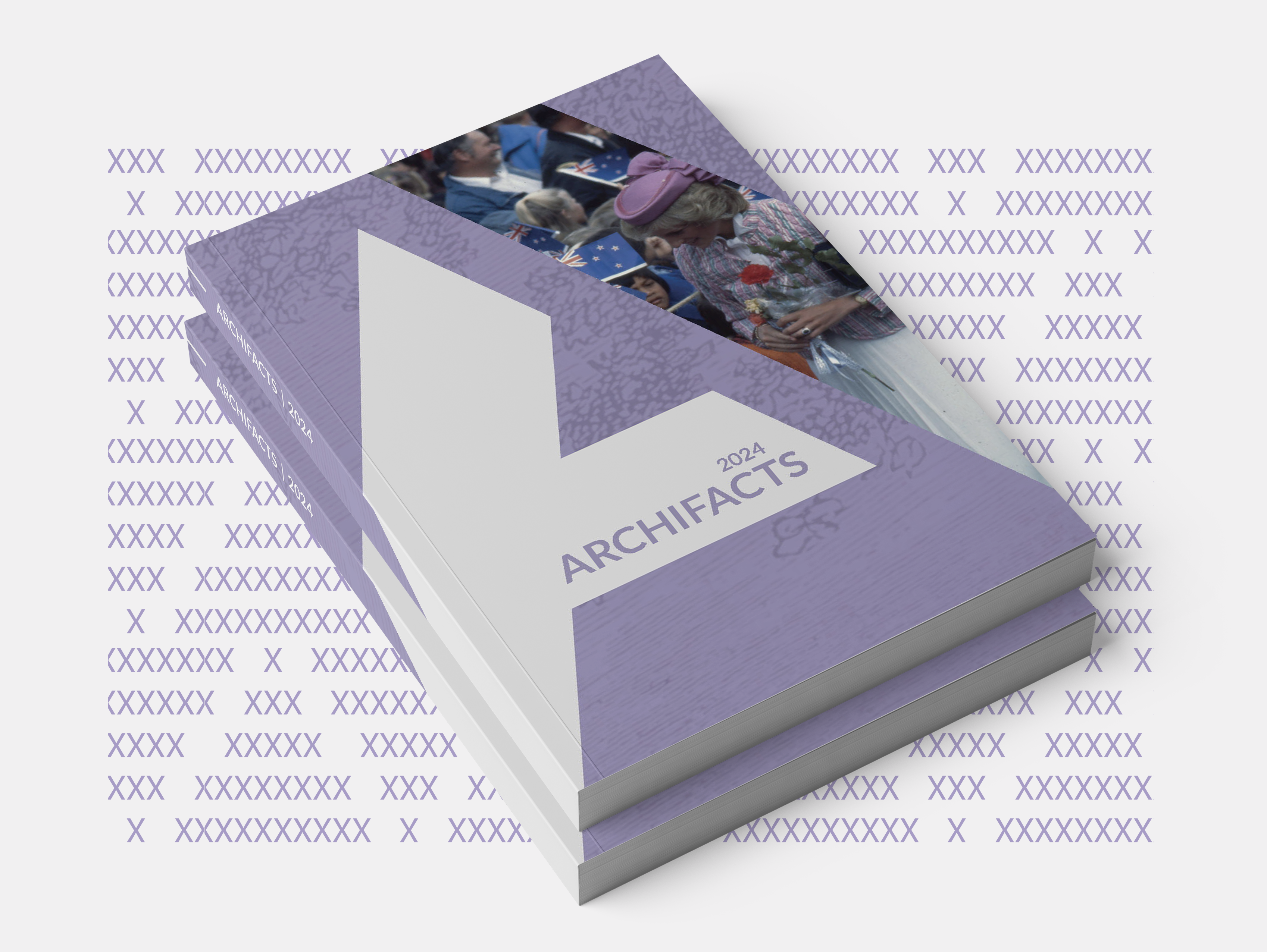
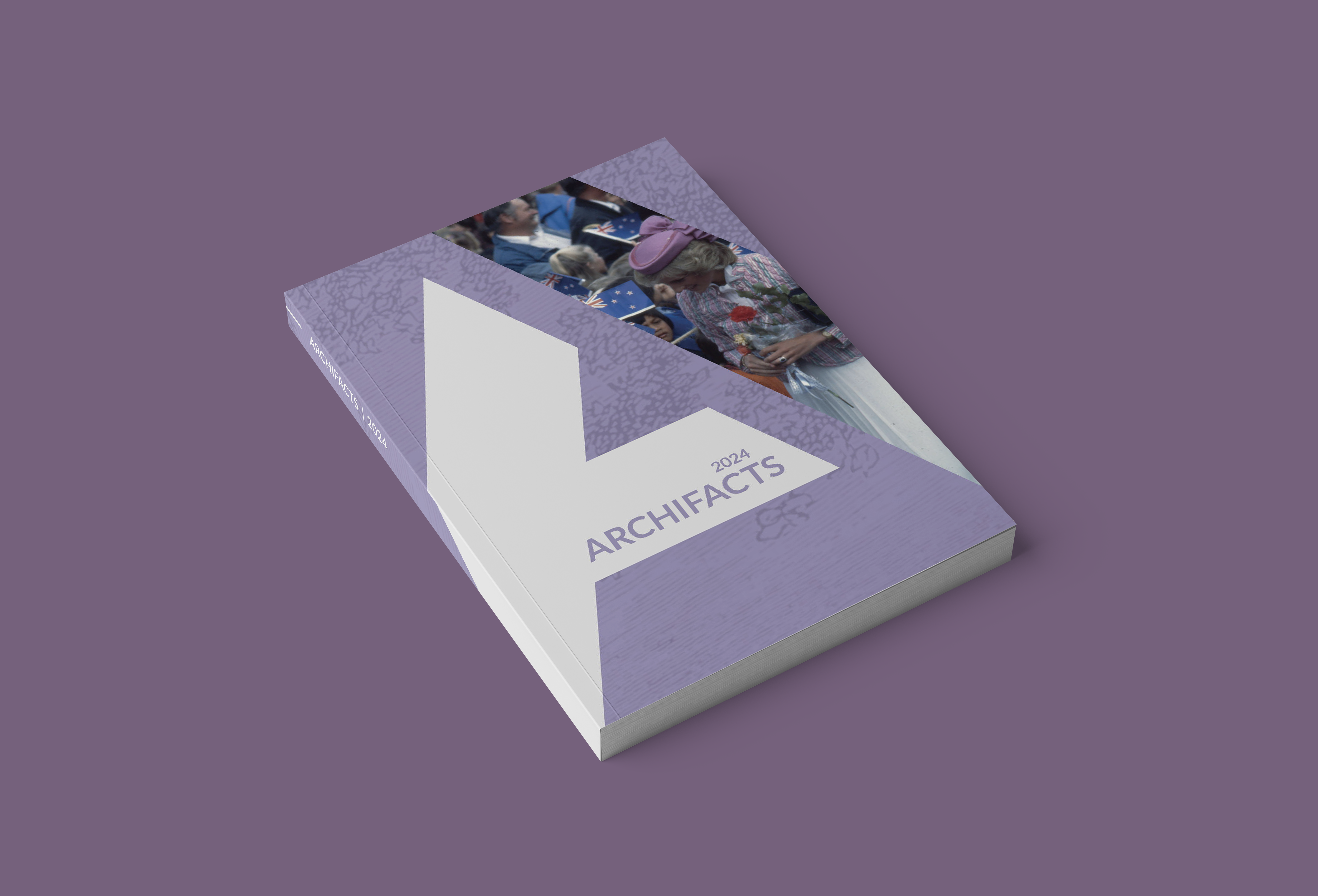
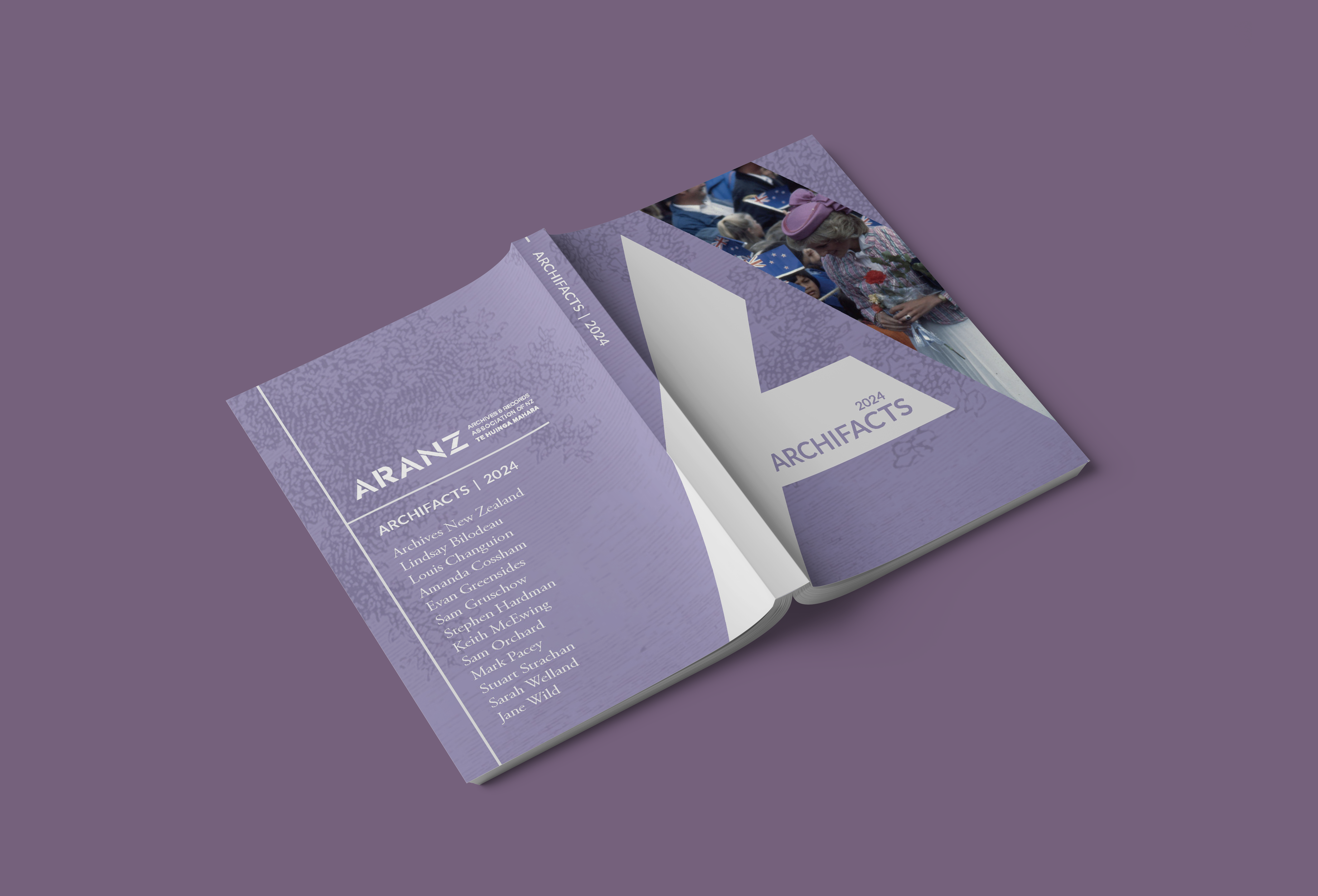
The 2024 issue featured on the cover a photo of Princess Diana’s visit to New Zealand in 1983, taken by photographer Peter Bush. We sampled the colour of her headpiece and used it as the theme colour for the issue.
Next year, we will pick another excellent photo from the submitted articles, and pick another colour from that photo.
The layout and texture of the cover will otherwise remain the same, helping people identify sequential issues of Archifacts on a shelf.
Inside, while the text and images will change, the overall structure will remain the same.
The visual language will also remain: the tukutuku motif, the distinctive borders and use of spacing, and the occasional repeat of the “A” logo.
We do have a couple of small ideas, little changes we’d like to make as part of our commitment to continuous imrpovement… read the 2025 edition to see this design get even better.
Journal
- Editing
- Layout
- Design
- Publishing
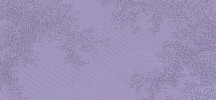
Tukutuku pattern
- Design

A legacy
Archifacts has been in print since 1974. It underwent a significant redesign in the early 1990s, and another in 2008.
The journal proudly carried that style for the next 16 years, and we hope that this new design will grace Archifacts for years to come.
Additionally, we consider this to be a template for other journal publishers to follow – an example of what an acedemic journal can look like in the 2020s.
We have proven that there is no need, and no excuse, to cram words up to the extreme margins on every page, or to have a cover that looks like it belongs in the final scene of Indiana Jones and the Raiders of the Lost Ark.
This design is attractive, it is readable, and it is economical.